More Examples
In this section, we show more example in gnuplot.
The script in this section can be found
script/examples.
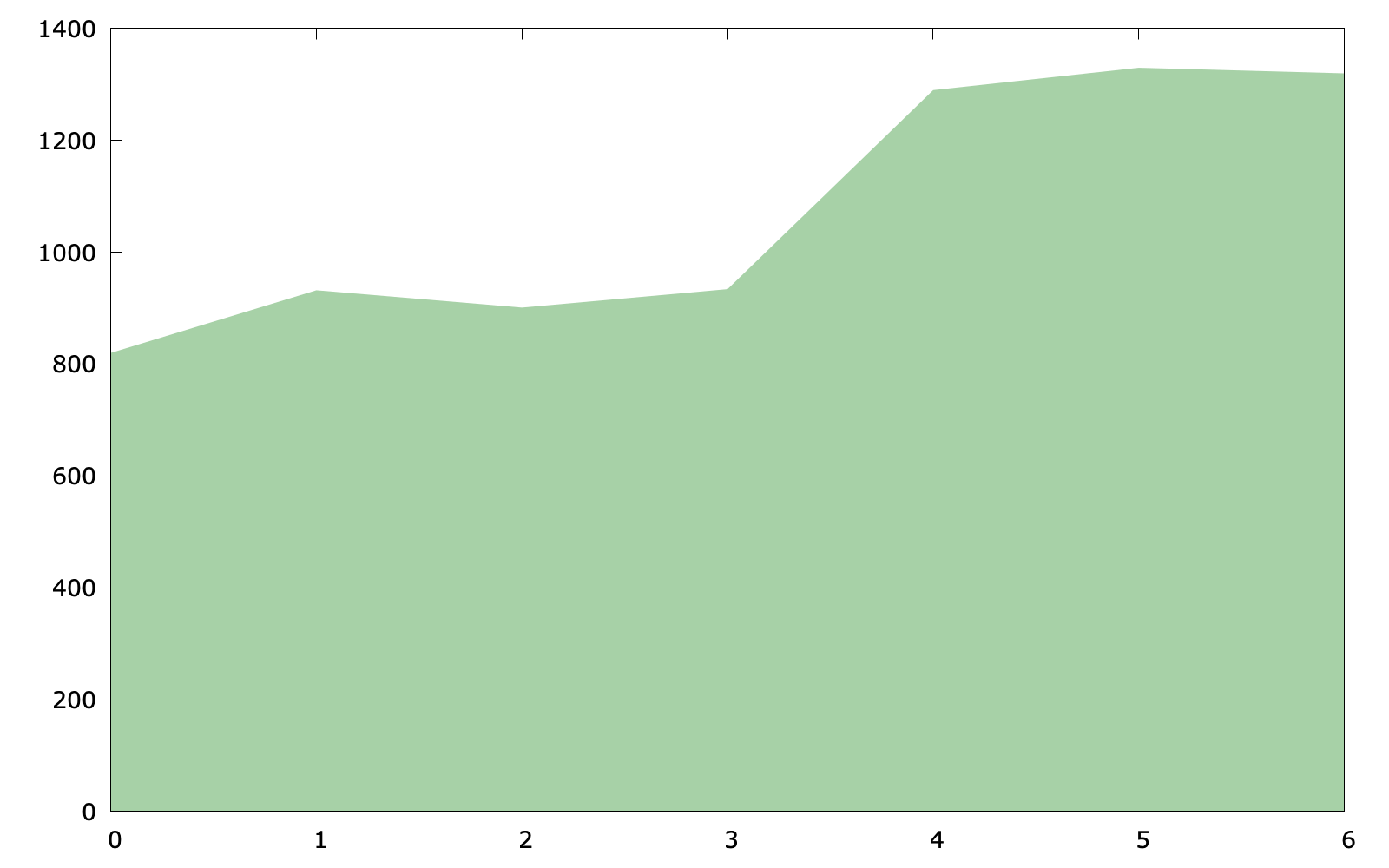
Basic area chart
set style fill solid 0.4 noborder
plot $data with filledcurves y=0 lc rgb "forest-green"
The key point of the code (area_chart.gp) is with filledcurves y=0, because we would like to set a line at y=0 (it is also fine to use y1=0).
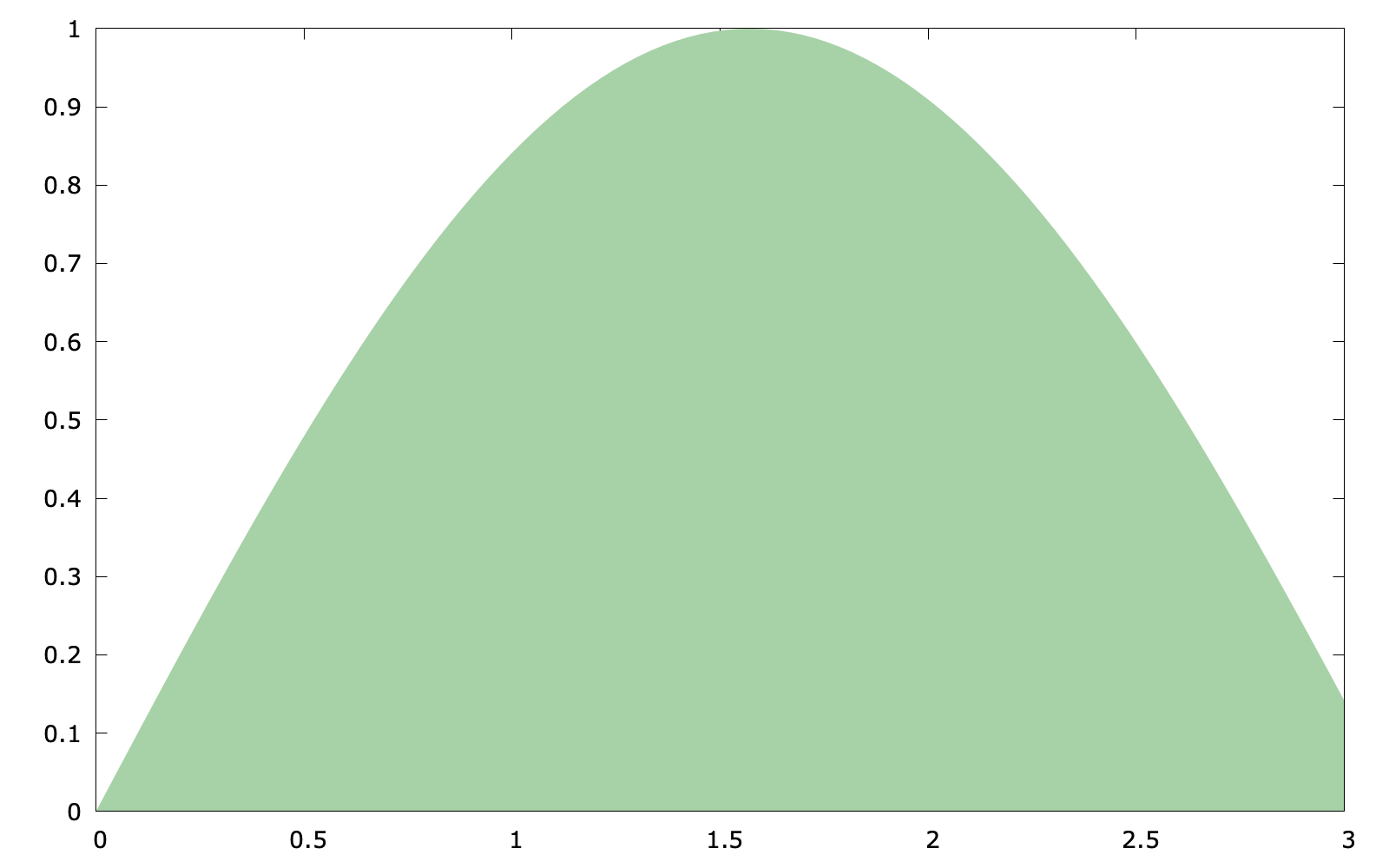
In addition, if the plot target is a function, the following code is also feasible:
set style fill solid 0.4 noborder
set style function filledcurves y=0
set xrange [0:3]
plot sin(x) lc rgb "forest-green"
The code above (area_chart2.gp) uses something new: set style function which changes the default plotting style for function plots
Stacked area chart
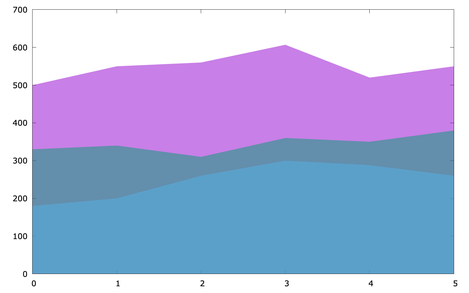
As for a stacked area chart, the code has no much difference (stacked_area.pg):
set style fill transparent solid 0.5 noborder
plot $data u 1 with filledcurves y=0, \
$data u 2 with filledcurves y=0, \
$data u 3 with filledcurves y=0
Revisit bar chart
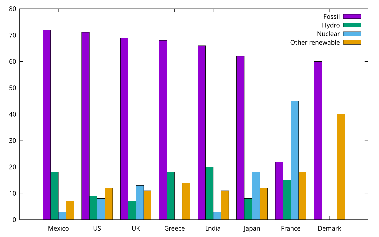
We have already shown how to use with boxes to plot categorical items in Plotting dates and strings, but for multi groups, a histogram is preferred. In the following, we use the provided energy file. This part is adapted from gnuplot 5 by Lee Phillips.
# Country Fossil Hydro Nuclear "Other renewable"
Mexico  72  18  3   7
US  71  9   8   12
...
Note that the specific value shown above are factitious.
set style data histogram
set style fill solid border -1
plot "energy" u 2 title "Fossil", \
"" u 3 title "Hydro", \
"" u 4 title "Nuclear", \
"" u 5:xtic(1) title "Other renewable"
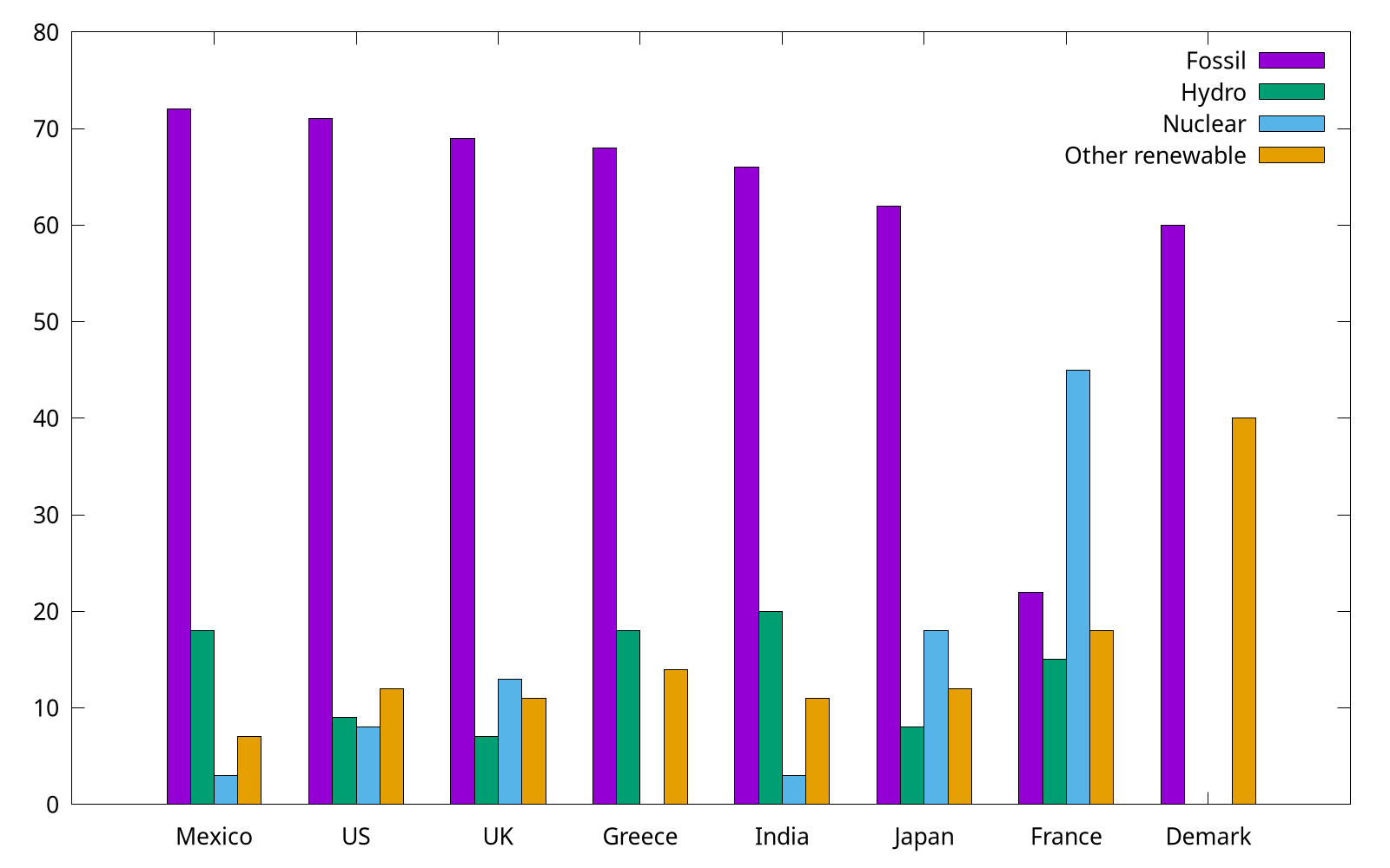
The complete code can be found at energy.gp. Gnuplot uses the "histogram" style for bar charts as well as true histograms. Because the country names (column 1) are expected to be labels on X, we use xtic (short for xticlabels) command to select the 1st column.
By the way, we can use set style histogram cluster gap <n> to set the gap between clusters. The default gap is 2. The following gap is 1, and as you can see, it has a slightly wider box.
